
EDA on Epidemic Events Data
Exploring epidemiological data gathered through web scraping
Intro
In my last post I discussed webscraping and went over the the proccess of scraping data on epidemic events throughout histopry from a web page. Today i will begin exploring this data using common exploratory data analysis techniques. This EDA will be performed using the pandas, matplotlib, and seaborn packages in python.
Methods
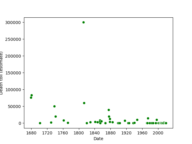
I began by cleaning the data set. I corrected the type of a few columns and removed any unneccassary columns. Several of the observations had an unknown death toll, especially those from longer than about 300 years go. This is reflected in the below figure, which only has data going back to aproximately 1680. Anything before than didn’t have a precise estiamte for the death toll in this data set.
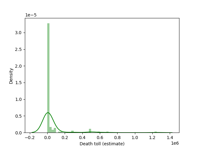
I wanted to see how high the death tolls were usually, so I created the below plot that shows the density and distribution of different totals. The curve plotted over the data shows that there is a very right skewed distribution. In other words, the higher death tolls were less common.
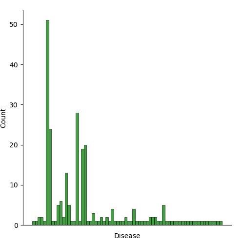
I also wanted to see how many epidemics of each disease there are in the data set. The graph below shows the count for each one. There are mutiple cases where similiar diseases aren’t grouped together because the column is a little messy, with some observations having notes in the disease column. The graph below shows that many of the listed diseses only have one instance, but there are some notably high counts, with highest belonnging to bubonic plague and smallpox)
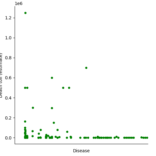
I then looksed at the death toll estimates for each disease. These are also very heavily grouped close to 0 when copmpared to the highest totals. The shrinking of the graph in order to include the high values helps to show how variable the disease death tolls can be.
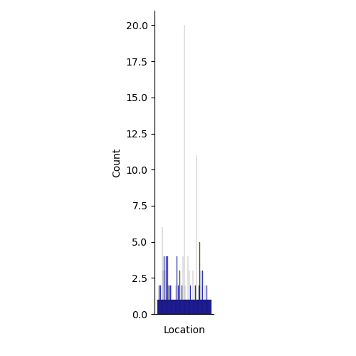
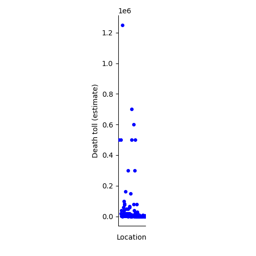
The following two graphs are simialr to the above two, but with location repalcing disease along the x axis. Similar issues pop up here too. Many lcoations only have one occurence because of the lack of a consistent naming convention in the data set. A more rigorous cleaning would allow for better grouping of locaitons, perhaps by country or continent.
The full code I used for the cleaning of the data and creation of these figures can be found at:
Conclusion
The data I gathered through scraping wikipedia in my last post contains a lot of interesting patterns but it does demonstrate some of the limitations of web scraping. The lack of a common naming convention and abundance of notes in cells prevented me from using mutiple observations in the visualizations. The table was obviously not intended to be easily analyzed. Nonetheless I was able to explore the data through EDA and find patterns in the distributions of the diseases and locations relating to their death tolls and counts. Even among uncommon events like epidemicas there are extreme outliers that have devastationg impacts compared to the majority of other cases.
Invitation
How would you recommend cleaning this data? Let me know in the comments below!